Brand design, packaging and retail brand management for the 'little deli with the big heart'
The Toll House Deli is an independent delicatessen in Chelsea, London, offering speciality coffee, breakfast and brunch, artisan focaccia sandwiches, fresh salads and its distinctive range of Basque cheesecakes.
Our brief was to create a brand identity with enough character to feel established and individual, while building a practical design system that could work across a busy food retail environment — from takeaway packaging and coffee cups to menus, signage, window graphics and in-store communications.
The result is a distinctive identity rooted in the character of The Toll House itself, supported by a flexible packaging system and an ongoing programme of design, artwork, sourcing and production management.
Creating an identity with a sense of place
Rather than creating a generic delicatessen identity, we wanted the brand to feel intrinsically connected to its Chelsea location.
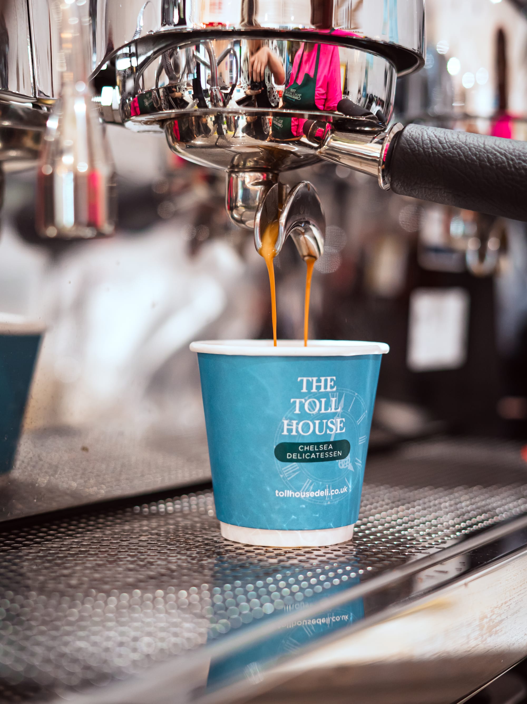
A central feature of the identity is the clock graphic, inspired by the architectural character associated with The Toll House. The clock became a secondary brand asset rather than simply a logo device: it can sit quietly behind typography, appear as an enlarged graphic across packaging or provide texture and recognition without overwhelming the main name.
The core identity combines the more traditional character of The Toll House name with a cleaner contemporary supporting design language. This creates a balance between heritage and modern food retail — appropriate for an independent Chelsea deli but flexible enough to work across everything from a small coffee cup to large-format exterior signage.
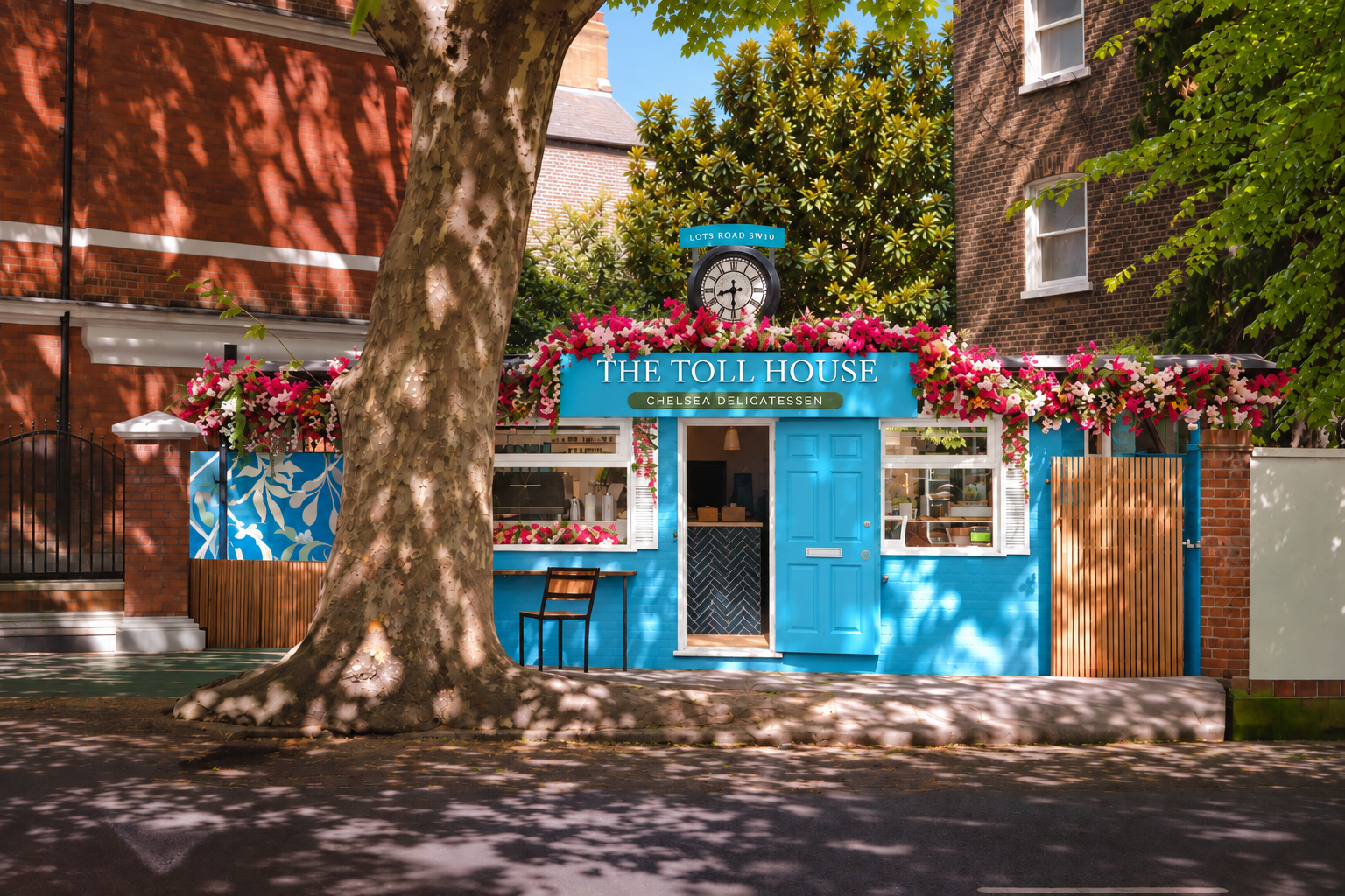
A tightly controlled colour palette was developed around a distinctive blue and deep green, supported by white and neutral packaging materials. The combination gives the brand a premium feel while remaining warm, accessible and highly recognisable.
The accompanying brand guidelines establish the logo structures, colour specifications, minimum sizes, clear space, reversed applications, secondary typography and use of the clock device, creating a consistent toolkit for future applications. Ineed now we are managing brand and graphics for the secoind unit in West London
Packaging designed as part of the brand experience
For a deli, packaging is one of the most frequently seen expressions of the brand.
Rather than treating individual items in isolation, we developed a packaging family capable of working across very different formats while still feeling unmistakably Toll House.
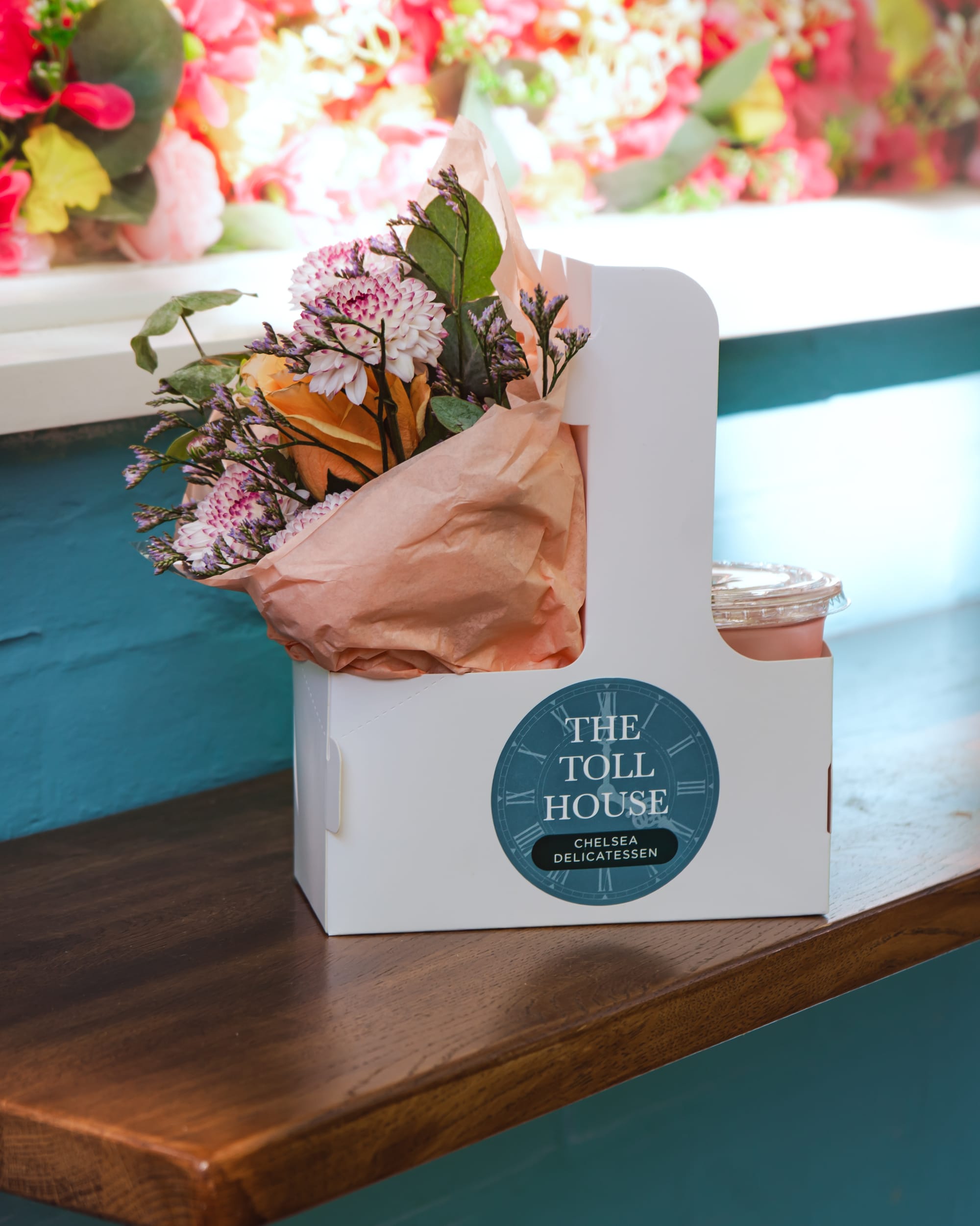
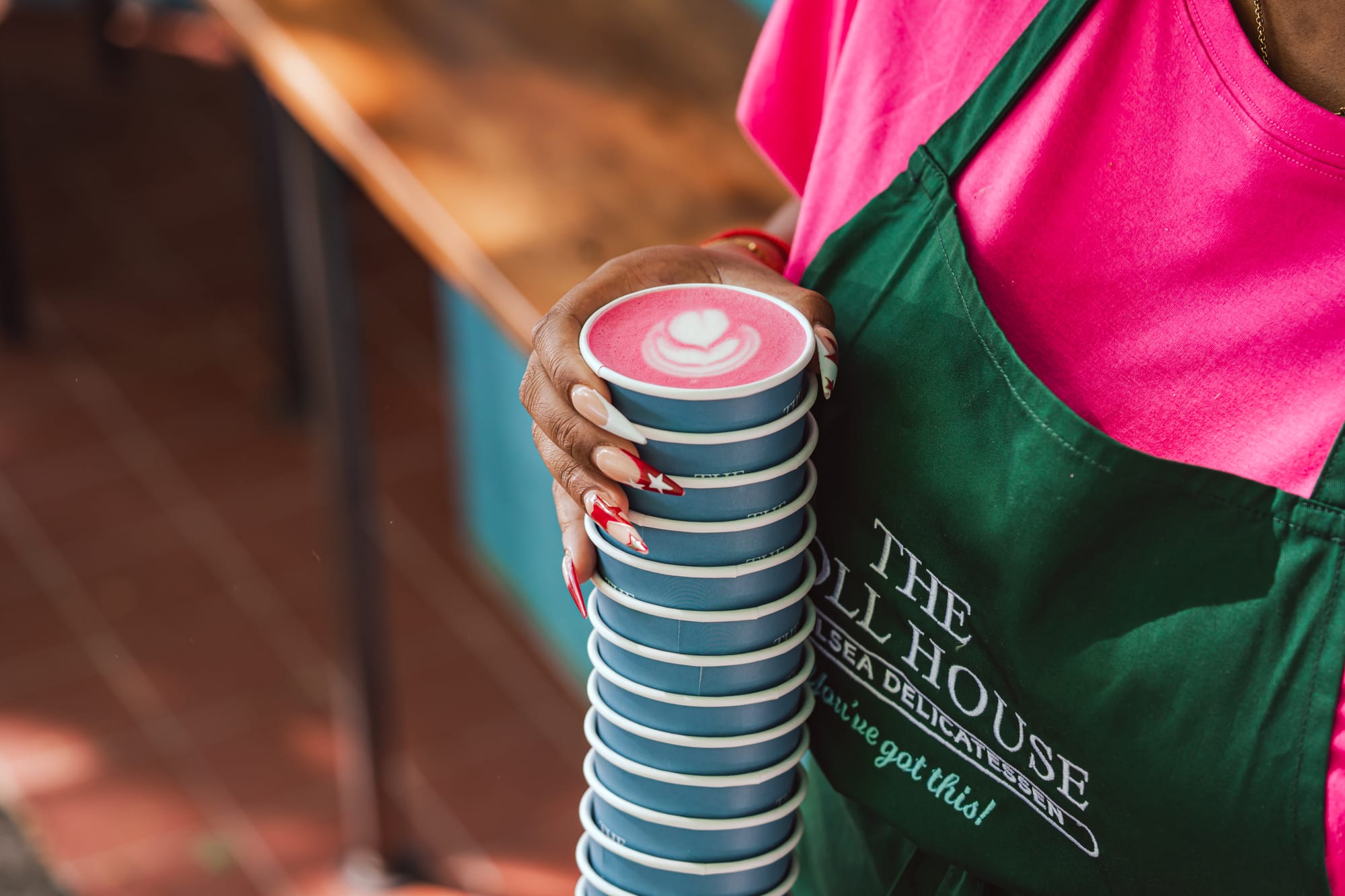
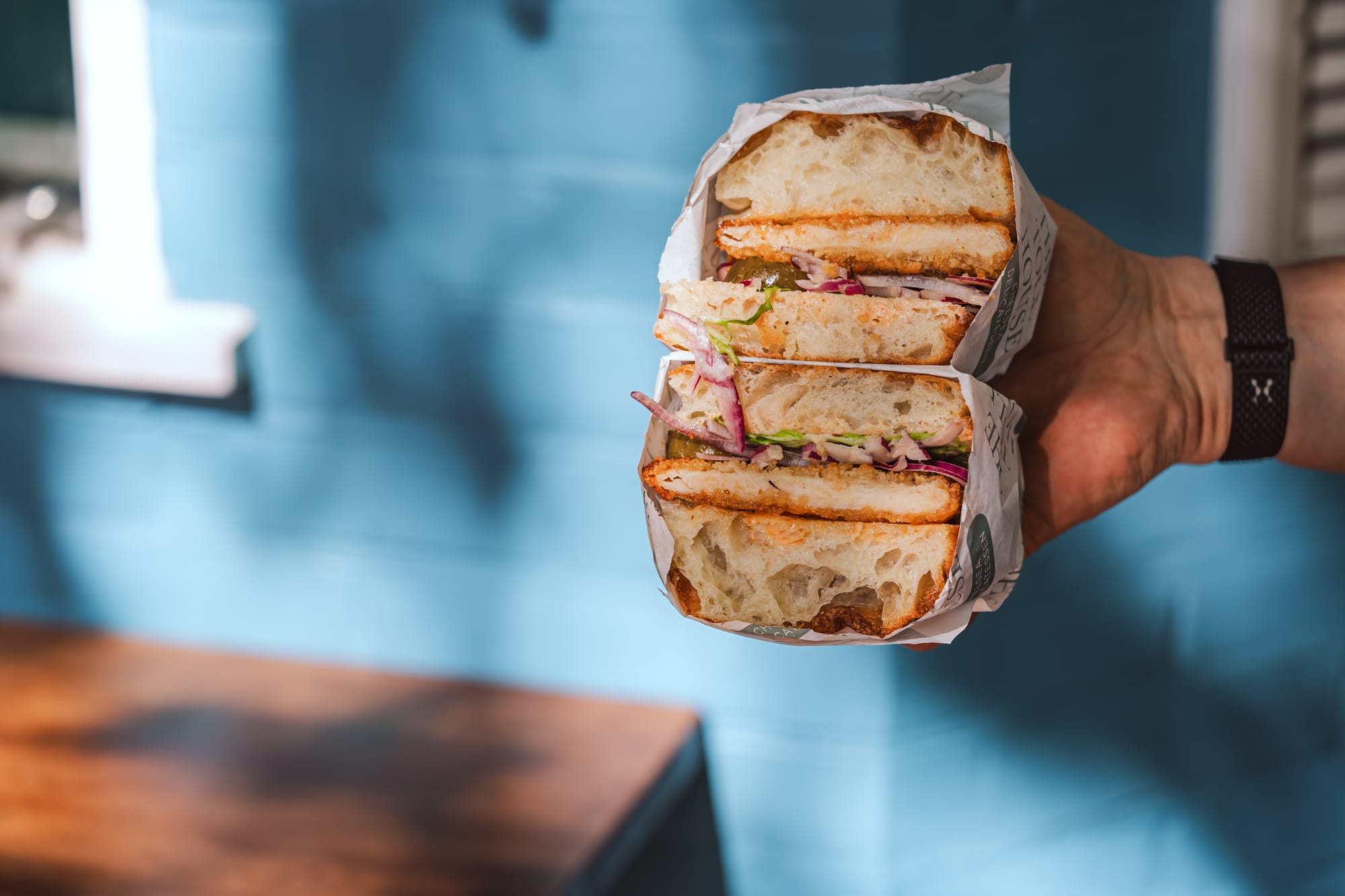
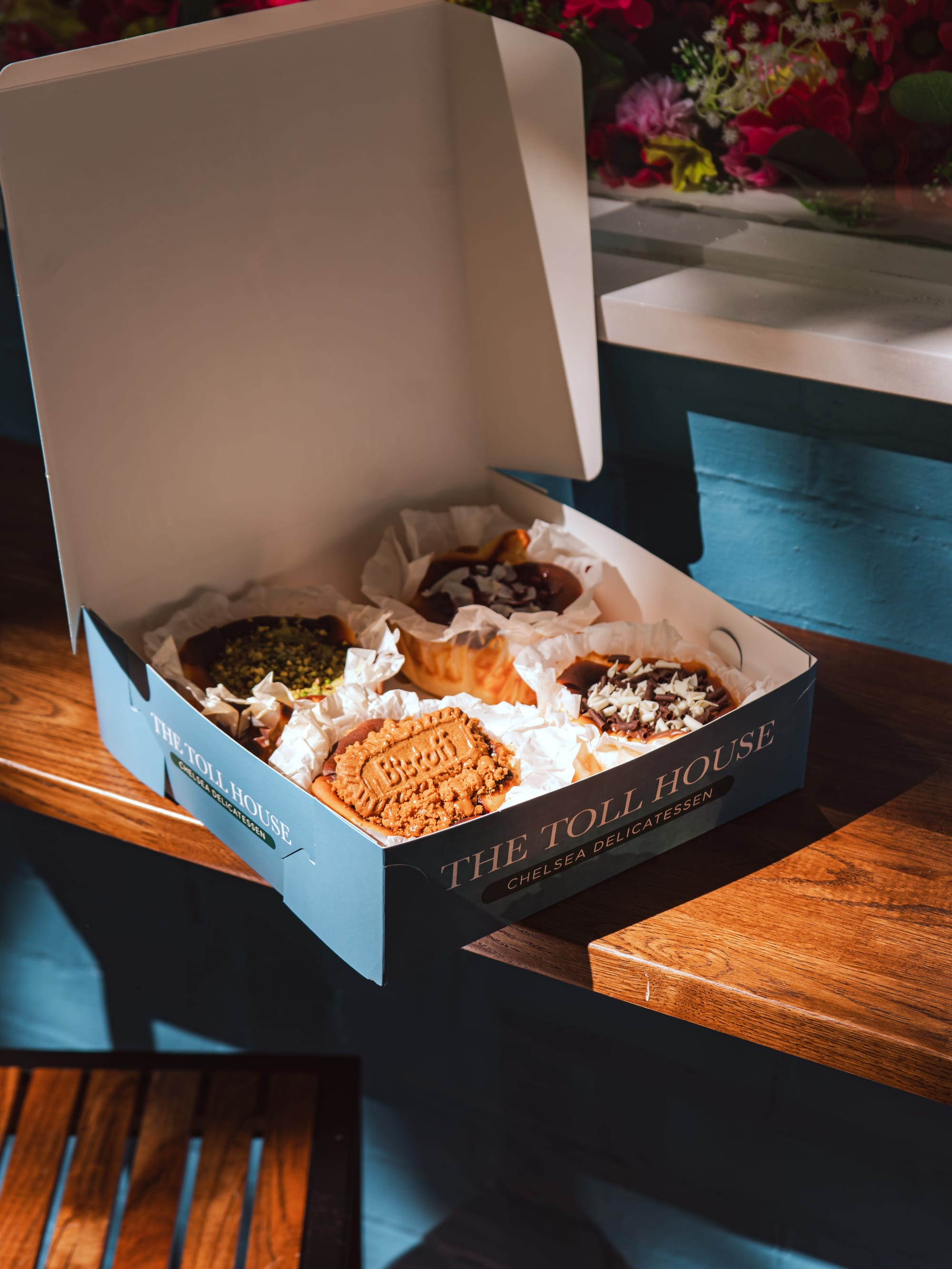
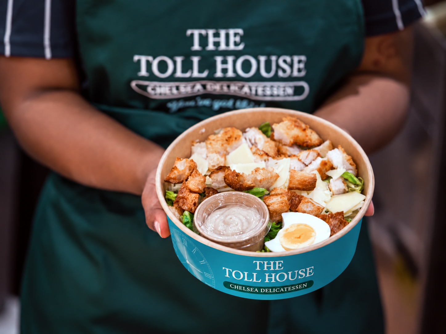
The programme has included branded twisted-handle takeaway bags, coffee cups, clear smoothie and cold-drink cups, greaseproof paper, stickers, salad and soup bowls, sandwich and pastry bags, cheesecake boxes, napkins and other food-to-go formats.
The challenge was to make a relatively simple two-colour identity work effectively across paper, board, clear plastic and adhesive formats, often with very different print restrictions and minimum order quantities.
The clock graphic provides a useful recurring element across these applications. On some packs it can become an all-over background device; on others the branding is deliberately simplified to maximise clarity and print efficiency.
From design concept to something that can actually be produced
Packaging design for an independent food business is as much about management and practical decision-making as it is about graphics.
Alongside the creative work, we have managed the process of researching formats, identifying suppliers, requesting and assessing samples, checking sizes against actual food products, comparing printed and unprinted alternatives, reviewing minimum order quantities and monitoring manufacturing lead times.
That has included working through choices such as whether an item should be fully printed or use a branded sticker, whether a lower-volume stock container provides better value than a bespoke format, and where investment in custom manufacture will make the biggest difference to the customer experience.
For items such as takeaway bags, cups and food containers, different quantities, production costs and lead times were assessed before artwork was committed. This allowed the visual identity to be developed alongside the commercial realities of running the deli rather than independently of them.
Managing the brand beyond the pack
The same visual language has been extended throughout the wider customer experience.
Our ongoing work has included menus, promotional leaflets, loyalty and collection materials, fridge labels, product tickets, stickers, cup artwork, door graphics and opening-hours communication, alongside advice on merchandising and the presentation of products within the retail environment.
This means the brand is managed as a complete physical experience, rather than a collection of unrelated design jobs.
As The Toll House develops, the system has also been created to scale into new locations. Work for a subsequent much larger site has extended the identity into architectural applications for planning applications including illuminated lettering, projecting signage, window graphics, awnings, pavement signage. Also adding additional items to the packaging catalogue.
One brand, from counter to street
The Toll House project demonstrates the value of treating brand, packaging and retail environment as one connected system.
A customer might encounter the identity on the shopfront, order from a menu, receive coffee in a branded cup, take away lunch in printed packaging and leave carrying a Toll House bag. Each element has a different functional requirement, but together they need to tell the same story.
Our role has therefore gone beyond creating a logo or a series of packs. It has been to develop and manage a brand system that can operate consistently across food packaging, point of sale, communications, interiors and exterior signage — while remaining practical to manufacture and flexible enough to evolve with the business.