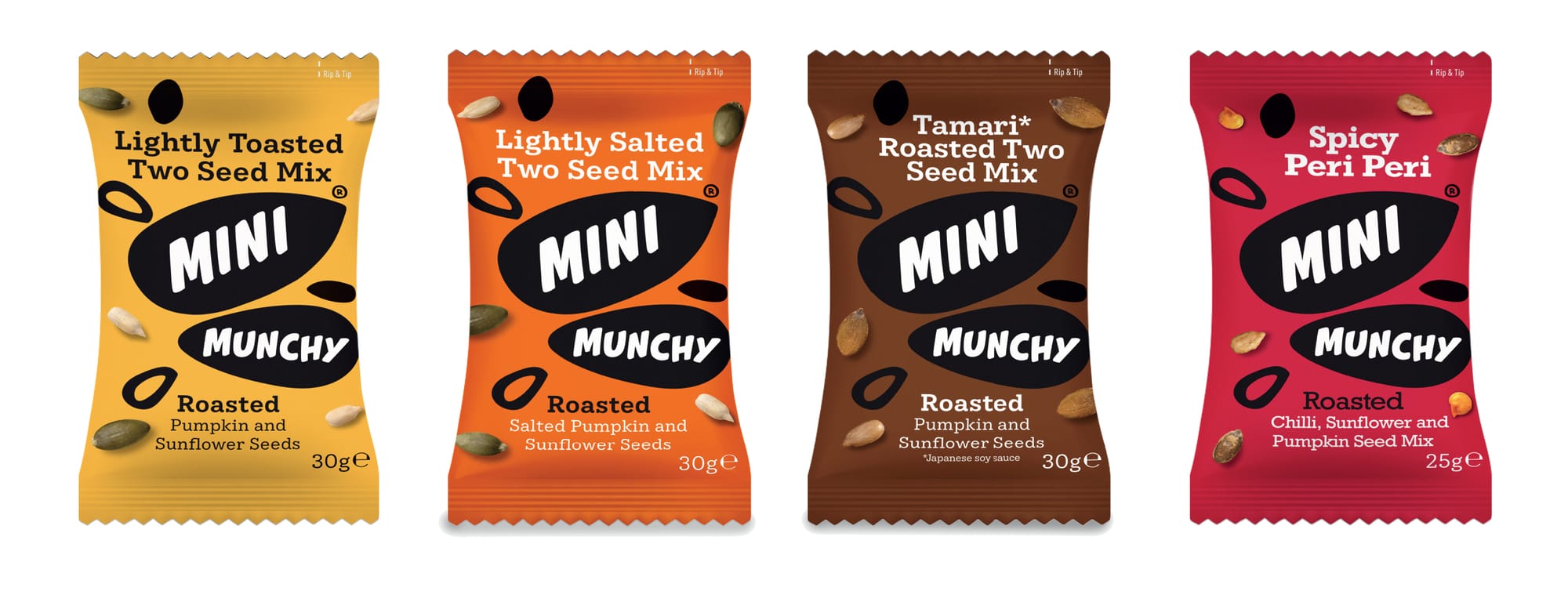
Taking Munchy Seeds on the go
A successful brand should be able to move into new formats without losing the personality and recognition that made it successful in the first place.
Mini Munchys gave us the opportunity to take the established Munchy Seeds brand into the fast-moving world of convenient, grab-and-go snacking.
The challenge was to translate all the colour, energy and personality of the core range into a compact 30g snack formatthat would be easy to recognise, easy to understand and easy to enjoy wherever you happen to be.
Small pack. Big impact.
When the physical size of a pack gets smaller, every element of the design has to work harder.
There's less space for branding, product information and communication – but the pack still has to compete for attention in a busy retail environment.
For Mini Munchys we concentrated on creating a strong, simple visual hierarchy with immediate Munchy Seeds recognition and clear differentiation between the individual seed mixes.
The result is a small pack designed to make a surprisingly big impression.
Designed for grab-and-go
Convenience was at the heart of the brief.
These weren't simply smaller versions of the existing Munchy Seeds packs. They were designed around a different consumer occasion – a quick, tasty snack that could be carried easily and eaten wherever the day takes you.
The rip 'n' tip format makes the product simple to open and enjoy on the move, while the compact size makes it ideal for bags, lunchboxes, desks and those moments when you simply need something to keep you going.
Understanding how, where and when a product is going to be consumed is an important part of good packaging design.
Because sometimes the format of the pack can be every bit as important as the graphics on it.
Extending the brand without diluting it
Introducing a new packaging format presents an interesting brand challenge.
It needs to feel new enough to have its own reason for being, while remaining familiar enough for existing consumers to recognise it immediately.
We retained the strongest visual characteristics of Munchy Seeds and adapted them to work within the much smaller format.
This creates continuity across the wider portfolio while allowing Mini Munchys to establish their own place within the range.
It's an approach we've used across our wider work for Munchy Seeds, including the development of new products and range extensions for Munchy Seeds.
Creating a strong family on shelf
Individual packs don't live in isolation.
Whether they're displayed in a supermarket, convenience store, café or food-to-go environment, products need to compete with dozens of other brands for attention.
Colour and range architecture therefore play an important role.
Each Mini Munchys variant has its own personality and is easy to identify, but when several packs appear together they create a much stronger branded block.
That's important commercially.
More products shouldn't mean a more fragmented brand. Done properly, every new product should help make the master brand more visible.
Packaging for changing eating habits
The way we snack has changed enormously.
Consumers increasingly want convenient products that fit naturally into busy lives – something that can be put into a bag, taken to work or enjoyed between meals without preparation.
For food brands, that creates opportunities to take successful products into entirely new consumption occasions.
But simply making an existing pack smaller isn't enough.
The proposition, format, communication and design all need to reflect how consumers will actually use the product.
Mini Munchys were created with that occasion in mind from the outset.
From one product to a bigger brand
One of the things we particularly enjoy about our long-standing relationship with Munchy Seeds is helping the brand evolve.
As new products, flavours and formats are introduced, our role is to make sure the brand continues to feel coherent and recognisable while giving each new idea enough freedom to succeed in its own right.
You can also see how we've approached this across our Munchy Seeds range extension packaging and our work developing the Need Seeds range.
Together, the projects demonstrate how a strong brand identity and carefully considered packaging architecture can allow a food brand to expand into new products and new occasions without losing sight of what made it distinctive in the first place.
Great packaging starts with understanding the occasion
For us, packaging design isn't simply about making something look attractive.
It's about understanding who is going to buy it, where they're going to see it, why they'll choose it and how they're going to use it.
Get those things right and design becomes much more powerful.
It turns a pack from something that simply contains a product into something that communicates, differentiates and sells.
And for Mini Munchys, that meant putting a lot of brand into one very small pack.